
Chart
Overview
The Chart element is designed to provide a modernized and customizable graph-based display to allow for easy visual evaluation of readings captured by the eGauge meter. The Chart element is optimized for mobile browsers and small screens, with a minimal amount of visual clutter compared to the original graph view.
Make sure to read the main Modern user interface page before continuing.
Contents:
Saving and Loading Chart Setups
Navigation
All displayed values are updated once per second. However, a slow or high-latency connection may result in slower updates.
The Chart element is composed of two parts:
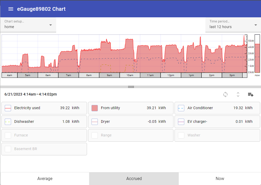
Chart
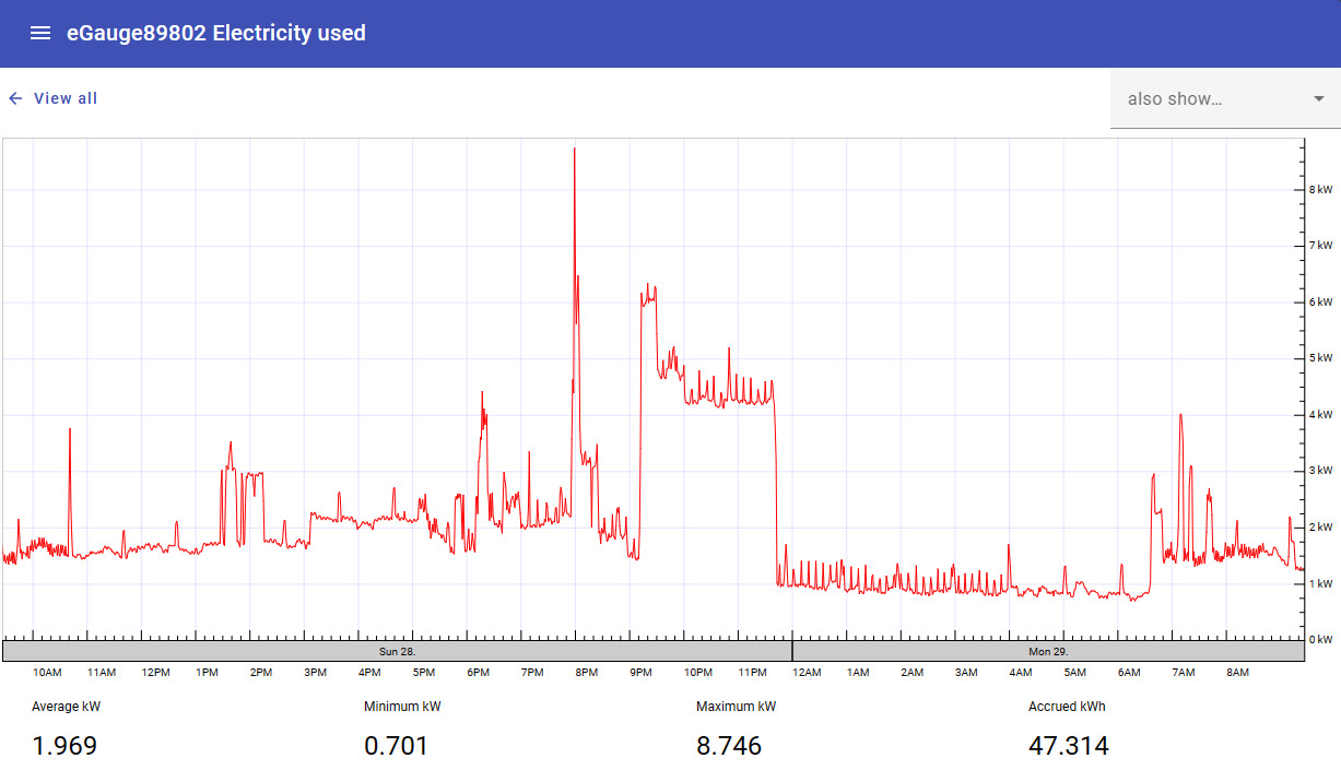
The chart displays a graphical representation of recorded values, plotted over time. The time period to display can be selected using the "Time period..." dropdown menu in the top right corner of the page.

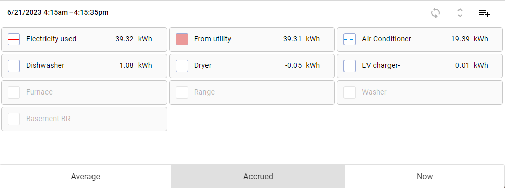
Chart Item List
The chart item list contains all chart items available for display in the chart.
To toggle a chart item on or off within the graph, click or tap the box to the left of the chart item name.

Chart item on
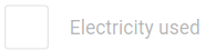
Chart item off
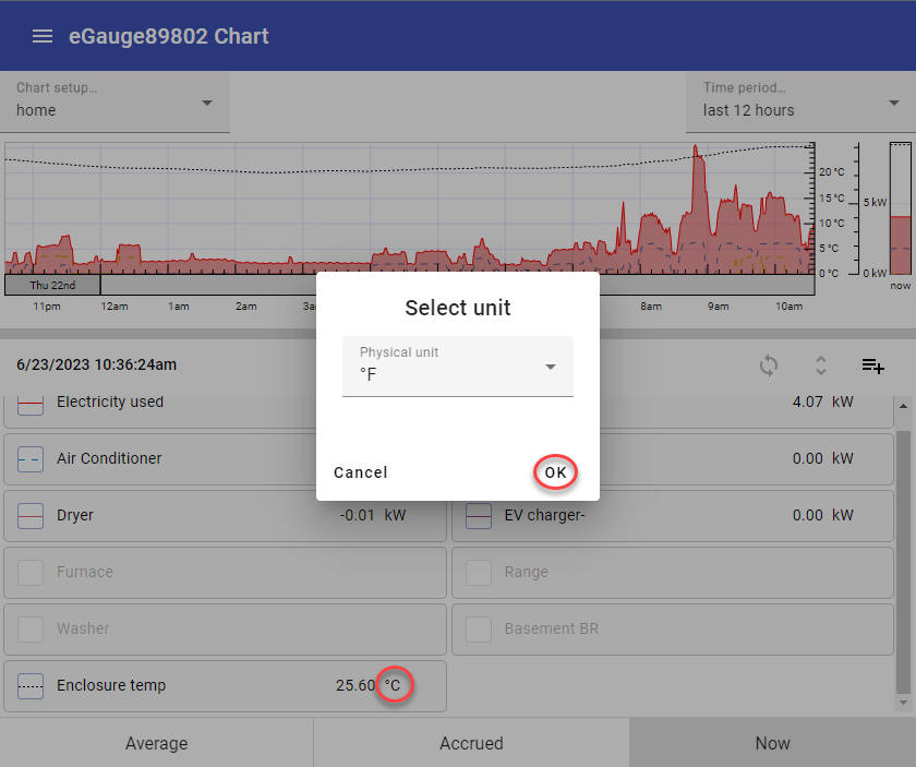
To change the unit displayed (e.g., from °C to °F), click on the measurement unit in the item list and select the desired unit. Click 'OK' to apply. The unit can also be set under 'Advanced options' in the main options for a chart item.
The chart item list also contains a summary value for that chart item. This value can be toggled between the following using the buttons at the bottom of the screen:
Average - Average value (eg, kW) of the chart item over the period selected in the graph.
Accrued - Cumulative value (eg, kWh) of the chart item over the period selected in the graph.
Now - Current value (eg, kW) of the chart item at the current time.
To view a graph of a specific chart item, tap or click on the chart item name. This will load a new graph containing only those values, along with some summary information at the bottom of the page.
To return to the main chart view, click the "View All" button in the top left of the page.
To compare the currently selected data against another set of data (eg, this week's data against the previous month), use the "also show..." dropdown menu in the top right corner of the page. When a time frame is chosen in this dropdown, the graph will compare the more recent value to the same value relative to the time frame chosen.
Introduced in firmware v4.6 this dropdown also includes the option to highlight some basic demand information. You can choose to show max or min set or rolling demand.
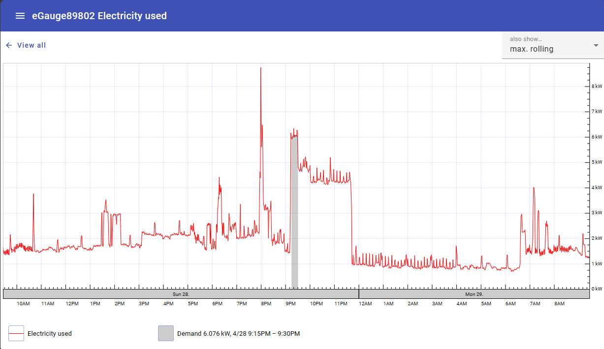
The demand interval used for this feature is set in the eGauge classic interface preferences editor which is accessed via the Main menu: Setup → Other Settings, then choose Preferences at the Left under the eGauge logo.
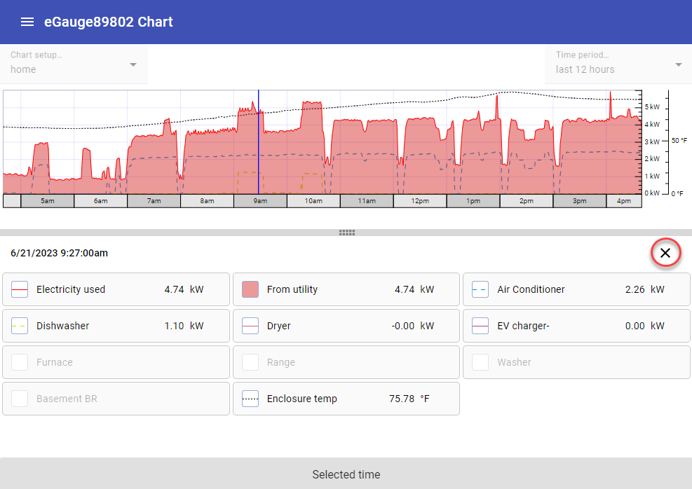
Viewing values at a specific point in time
Click on any point on the chart graph to view instantaneous register values at that specific point in time. Each item in the chart item list will display its value at the selected time.
Click the X at the top right corner of the chart item list to return to the main chart view.
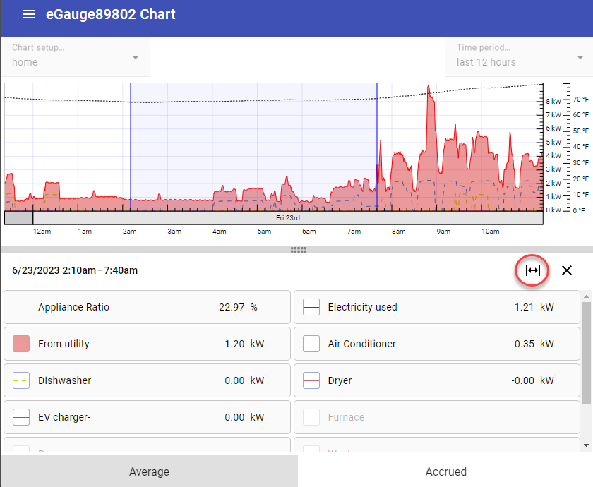
Clicking and dragging after selecting a specific point in time will shade in a period of time to inspect. Click the 'Zoom to selected range' button to zoom into the shaded area. Click 'Restore time period' to go back to the original set time frame of the chart.
Configuration
By default, the Chart view will contain chart items displaying values obtained from the "Usage" and "Generation" virtual registers configured under Settings -> Installation (assuming these virtual registers are configured). However, most users will want to add additional chart items.
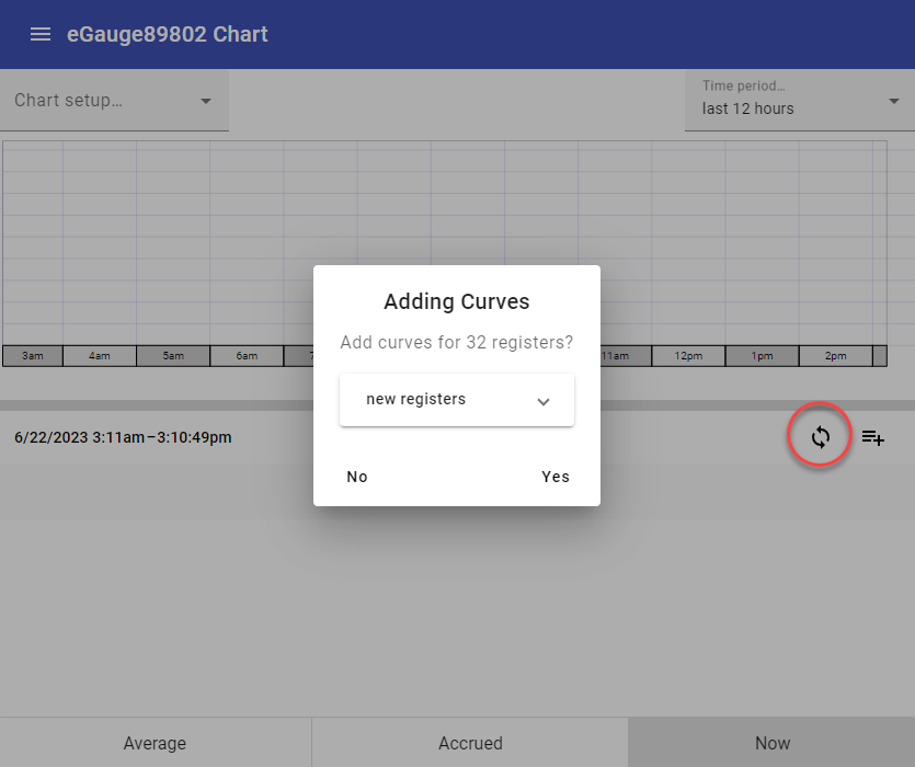
If your device has been configured, you may use the Chart Synchronization feature to auto populate a new chart with all available registers. Click 'Yes' to add all available registers to your new chart. As long as the synchronization option is enabled, the chart will continue to sync all available registers. Click the sync button again to disable synchronization if you want to remove some items from the chart list.
Charts created in the Chart view cannot be opened in the Dashboard view (and vice versa).
Tap or click the "Add" button above the register list to add a single new chart item.

The list of chart items may be hidden at the bottom of the chart. To reveal the list of chart items, click or tap on the bar at the bottom of the chart and drag up.

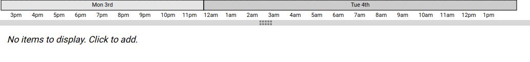
A fresh or empty chart won't have any chart items, and as such won't have an "Add" button. In this case, tap anywhere in the list area to add the first item.
Newly added chart items may take a few seconds to start displaying values. This is normal.
To edit an existing chart item, long press on that chart item in the chart item list.
This will open a window where a new chart item can be configured. There are three potential chart items which can be displayed:
Curve
A curve is simply a line generated from the values contained within a register in the eGauge's database. This is the most commonly used chart item. In this example, we'll graph the value of the Usage register (which records total site usage).
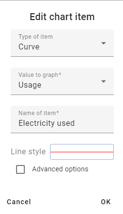
Value to graph - register used to populate the chart item with data. In essence, the actual value used to generate the line.
Name of item - name to display on the chart and chart item list. Completely arbitrary, but should make sense to the user.
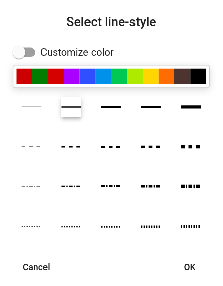
Line style - allows the user to define a line color and/or line style (solid, dashed, dot-dash) for the chart item. The "Customize color" option can be selected to choose a specific color or enter a HEX code for the desired color.
Advanced options
Physical unit - This setting will change the physical unit the reading is displayed in.
Flip sign of graphed value - unlike the Classic eGauge UI, the chart will graph negative values below the x-axis and positive values above the x-axis. To maintain the desired layout, it may be necessary to flip the polarity of one or more registers so they all graph above or below the x-axis.
Show accrued value - graphs a cumulative value instead of an average value. In essence, this displays a graph of the total value for a register. For most registers, this would be an ever increasing or decreasing line. When this option is selected, a new dropdown "Accrue since" will appear to select the start of recording for this register (eg, since start of hour, since start of day, and so on). Useful for measurements like pulse counts.
Shaded area
A shaded area can be used to add emphasis to the chart. There are many uses here, but in this example we'll replicate the shading present in the "Usage" line on the original eGauge UI.
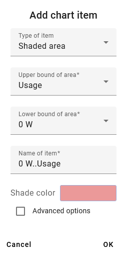
Name of item - name to display on the chart and register list. Completely arbitrary, but should make sense to the user.
Lower bound of area - the "bottom" of the shaded area. In this example we're using '0 W'. This dropdown will always display in the unit type for the register being displayed.
Upper bound of area - the "top" of the shaded area. In this example we're using the value of the "Usage" register
Lower and upper bound can be used to highlight the range between two chart items. This relationship cannot be inverted (eg, shading will display if upper > lower but not if lower > upper). A second shaded area item is needed for this.
Reported register value - The value reported for the chart item in the chart item list below the chart. Can be left blank, or associated with a register value. In this case, we're using "Usage" since the value of the shaded area and the value of Usage are the same.
Shade color - allows the user to define a shade color for the shaded area chart item. The "Custom color" option can be selected to choose a specific color or enter a HEX code for the desired color.
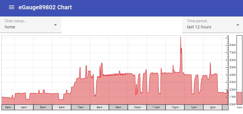
This is the result - note the red line for Usage, and the lighter red shaded area associated with that line.
Ratio
As its name suggests, the ratio chart item can be used to display the ratio between two values. These values can be obtained from registers, fixed numerical values, or a combination of the two. Unlike the other chart items, a ratio item will only appear in the list of chart items at the bottom of the page (nothing is displayed in the chart itself). In this example, we'll look at the ratio between total usage and electric heat usage.
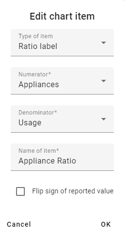
Numerator - "top" of the ratio equation. A ratio is simply A/B - this would be value A.
Denominator - "bottom" of the ratio equation. A ratio is simply A/B - this would be value B.
Name of item - name to display on the chart and register list. Completely arbitrary, but should make sense to the user.
Flip sign of reported value - can be used to flip the sign/polarity of the resulting value if desired.
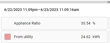
Ratio chart items always return a percentage. In the case of this example, we can say "the Appliances account for approximately 30.54% of the total electrical usage".
Rearranging and Removing Chart Items
Chart items can be rearranged by clicking the rearrange icon above the register list:

To rearrange the register list, tap or click on a register and drag it to a new position in the list. To remove a register entirely, tap or click on the X on that item in the list. When your list has been arranged as desired, click the rearrange icon again to exit rearrange mode.
Registers are rendered in order - the first register is displayed in front of all other registers, the next register is displayed behind the first register and in front of the remaining registers, and so on. The page must be reloaded to see changes.
Saving and Loading Chart Setups
The layout of a chart (chart items, colors, line styles, data to display, etc) is referred to collectively as a "chart setup". Chart setups can be saved to the meter. This is beneficial, as it allows multiple layouts to be preserved and allows multiple users to select the layout they're interested in. For example, a building manager might want to see a general overview of the site, while a tenant might only be interested in their specific usage profile.
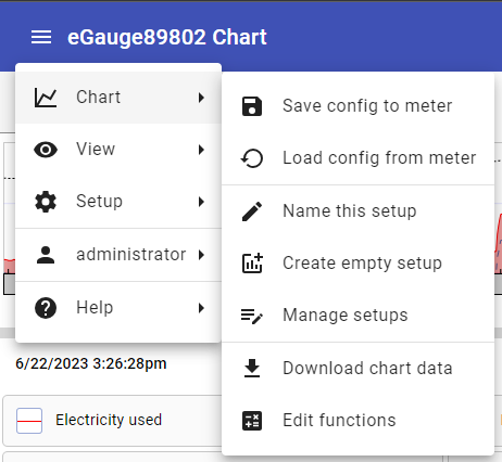
These functions are accessed using the menu in the top left corner of the page. Tap or click the menu, then tap or click "Chart" and select the desired function.
Save config to meter - saves the current chart setup as the default chart setup to load when the page is accessed by any user. This function is also used to save changes to existing charts and dashboards.
Load config from meter - loads the default chart setup. Use caution here if your current chart setup hasn't been saved! This function is also used for loading existing setups to new computers or new browsers that have not yet accessed the eGauge, or to update the setup when changes have been made.
Name this setup - names and saves the current setup. Once at least one chart setup is saved, the "Manage setups" option will be available, and the different setups can be changed from the chart view itself.
Create empty setup - creates a new chart setup with no chart items. Use caution here if your current chart setup hasn't been saved!
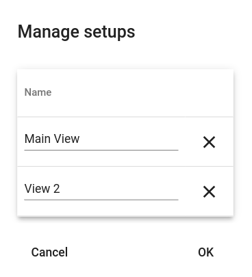
Manage setups - Opens a new window where the user can rename or delete saved chart setups. Click "OK" to save changes, or cancel to discard changes.
Downloading Chart Data
Chart data can be downloaded for use in external processing or to create a backup or report. To do this, click or tap the menu icon in the top left corner of the graph, select "Chart", then select "Download chart data."
The resulting export will only contain values for Curve-type chart items. These values are paired with both a unix timestamp and standard date and time value for ease of processing. The values themselves are instantaneous values which are are automatically presented in a granularity based on the time frame displayed in the chart.
For more control over export data, it may be desirable to use the JSON web API or the XML API
Chart data is not the same as a backup file. It cannot be restored to the eGauge meter in the event of data loss. For information on creating a backup file, see this article.