Modern Interface
- Modern User Interface
- Chart
- Dashboard
- eGauge App Overview (Android and IOS)
- Saving and Sharing Charts and Dashboards
- Export
- Dashboard Manager
- Alert Viewer
- Health Checker
Modern User Interface
Check out the User Interface Tour for an introduction to using the Chart!
The eGauge App provides ease of access to the Modern user interface. For information on using the eGauge App, please visit this article.
The Modern UI requires a login, installers should be sure to provide their customer with a valid device login for Chart and Dashboard customization or to use the eGauge App.
Overview
The classic eGauge UI has existed in pretty much the same form since the creation of the meter. Originally, this UI was designed to focus on a few data points (all power-related). As the eGauge meter has continued to evolve (support for remote devices, additional sensor types, and many more non-power measurements) the original interface has lagged behind the feature set supported by the meter. An updated, more feature-filled and flexible UI known as the "Modern interface" is available in firmware version 4.1. This new user interface is available on all meters at no additional charge, and simply requires a firmware update.
Modern Interface View
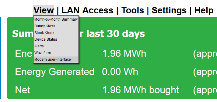
Most of the new UI elements are contained within the Modern user-interface view. On desktop browsers, the Modern Interface view can be selected by navigating to View -> Modern user-interface from the main graph page:
Alternatively, the view can be accessed by appending /ng to the URL used to access the meter (for example, DEVNAME.egaug.es/ng or DEVNAME.egauge.io/ng for a device accessed via the proxy server, DEVNAME.local/ng for a device accessed over the local network, IP_ADDR/ng for a device accessed directly or via IP address, etc).
Mobile browsers will default to the Modern user interface.
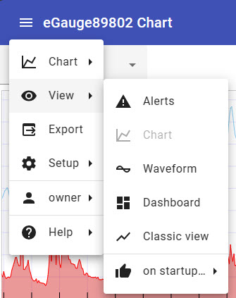
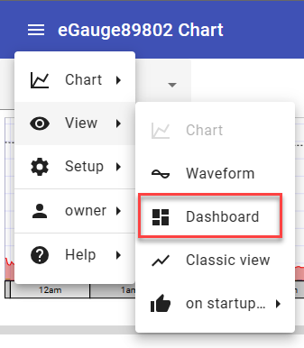
The first item (in this case, "Chart") will contain settings specific to the UI element which is currently loaded. The second item, "View", allows the user to switch between the various UI elements. "on startup" allows the user to select either the Chart or Dashboard view to load when the page is opened. The username of the user who is currently logged in ("owner" in this case) can be selected to log out. "Help" redirects to the eGauge support knowledgebase (https://kb.egauge.net/). Note that this link will only work if the computer used to access the meter also has internet access (whether the meter itself has internet access is irrelevant).
"Setup" contains advanced settings and configuration options - those are covered in detail here.
The Modern user-interface contains four major UI elements:
Chart
The chart element provides clean and streamlined graph-based display. This element is similar to the original eGauge interface but features additional customization options and is optimized for a mobile interface. More information on the chart element is available here.
Waveform
The waveform element allows for deep inspection of individual measurements taken by the eGauge. This tool is useful for phase checking and other analysis of raw sensor readings. More information on the waveform view is available here.
Dashboard
The dashboard element is a modular display which allows the user a great deal of customization. Multiple layouts can be created to get a better sense of how specific data points relate to one another. These layouts can be saved and utilized by others accessing the device. More information on the dashboard is available here.
Classic View
The classic view element simply redirects to the original eGauge interface. This interface is much more limited in terms of customization, but some users may prefer to work with the original interface depending on their needs. More information on the classic view is available here.
eGauge meters shipped after June 1, 2023 may default to the Modern user interface.
If you prefer to set your new eGauge meter to use the classic interface by default, use the main menu icon in the top left corner of the page to navigate to: View -> on startup -> Classic view
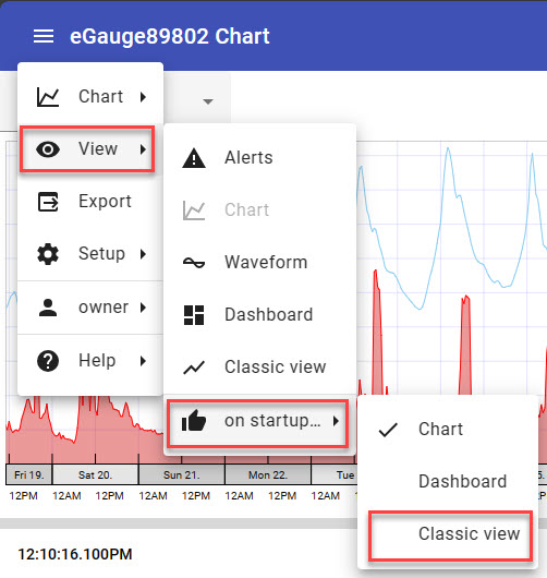
After clearing your browser cache, your device will load the Classic interface by default. You may choose to switch to the Modern interface in the future.
Accessing Configuration Settings
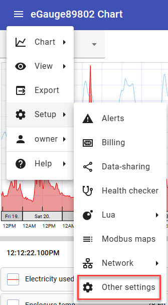
From the Modern user interface, the Classic device settings used for configuration can be accessed by using the main menu button at the top left corner of the page and navigating to: Setup -> Other settings. This will bring you into the General Settings page of your eGauge meter where you may configure the device settings as usual.
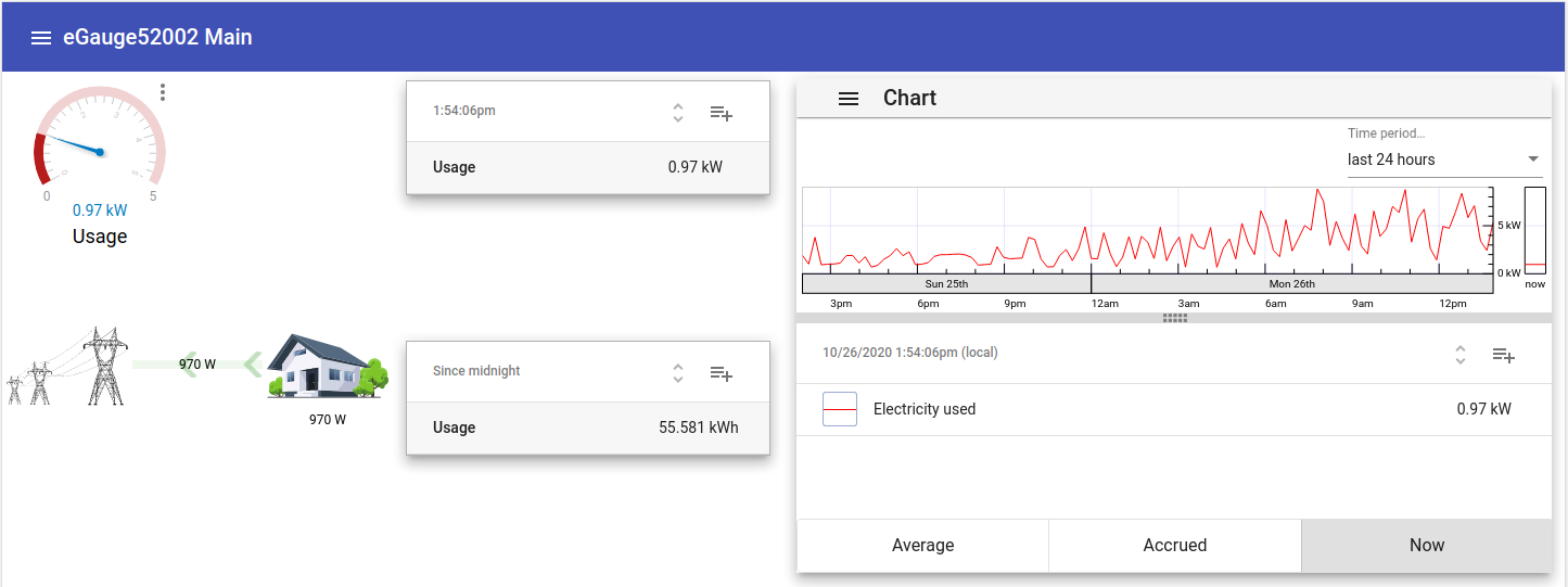
Chart
Overview
The Chart element is designed to provide a modernized and customizable graph-based display to allow for easy visual evaluation of readings captured by the eGauge meter. The Chart element is optimized for mobile browsers and small screens, with a minimal amount of visual clutter compared to the original graph view.
Make sure to read the main Modern user interface page before continuing.
Contents:
Saving and Loading Chart Setups
Navigation
All displayed values are updated once per second. However, a slow or high-latency connection may result in slower updates.
The Chart element is composed of two parts:
Chart
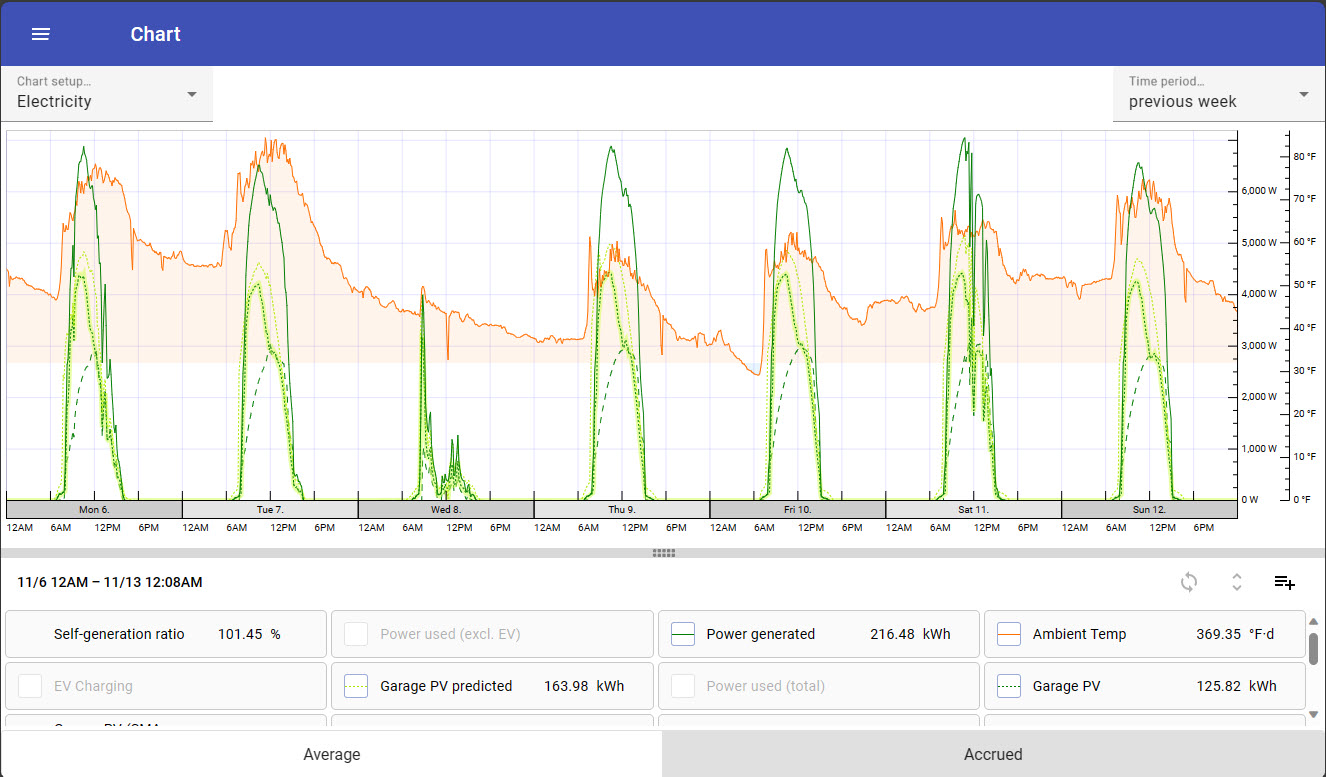
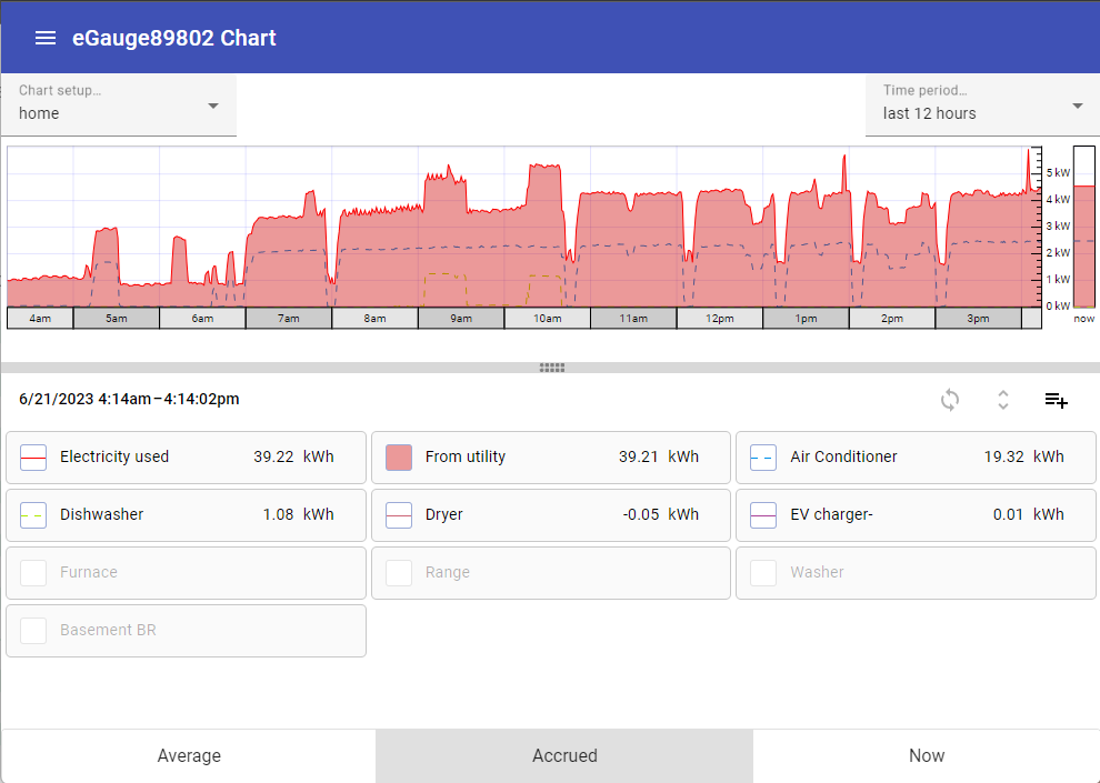
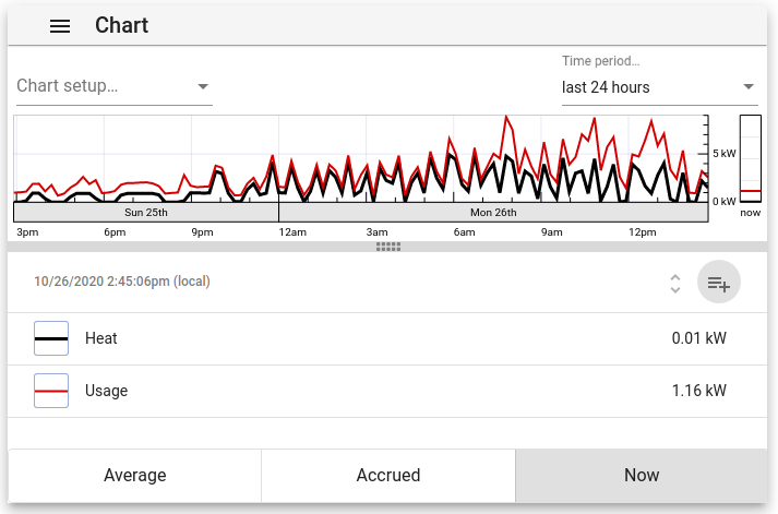
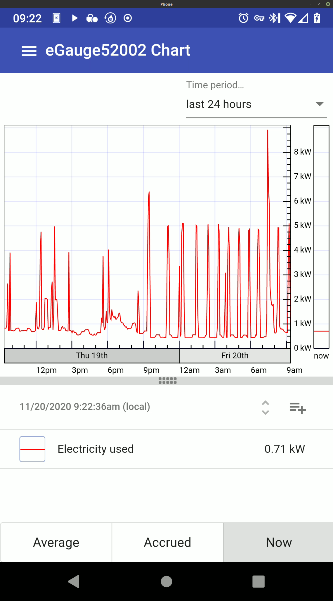
The chart displays a graphical representation of recorded values, plotted over time. The time period to display can be selected using the "Time period..." dropdown menu in the top right corner of the page.

Chart Item List
The chart item list contains all chart items available for display in the chart.
To toggle a chart item on or off within the graph, click or tap the box to the left of the chart item name.

Chart item on
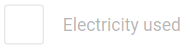
Chart item off
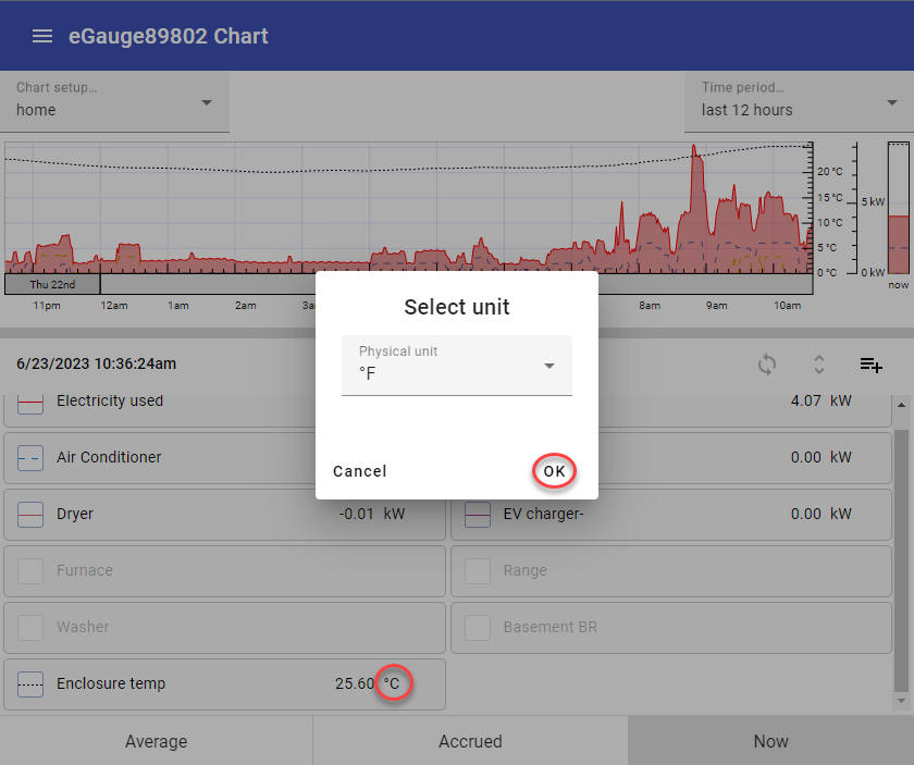
To change the unit displayed (e.g., from °C to °F), click on the measurement unit in the item list and select the desired unit. Click 'OK' to apply. The unit can also be set under 'Advanced options' in the main options for a chart item.
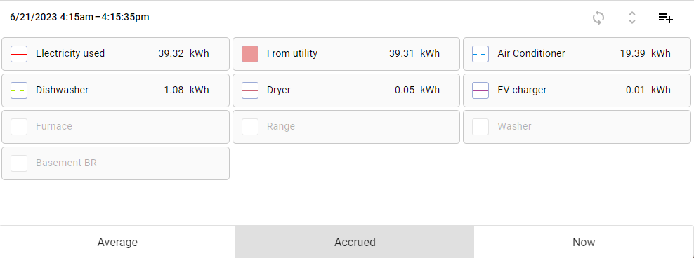
The chart item list also contains a summary value for that chart item. This value can be toggled between the following using the buttons at the bottom of the screen:
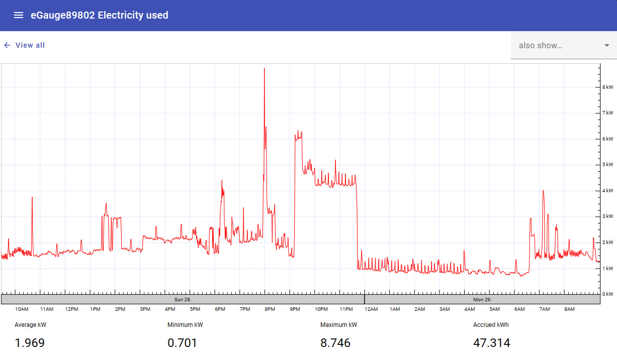
Average - Average value (eg, kW) of the chart item over the period selected in the graph.
Accrued - Cumulative value (eg, kWh) of the chart item over the period selected in the graph.
Now - Current value (eg, kW) of the chart item at the current time.
To view a graph of a specific chart item, tap or click on the chart item name. This will load a new graph containing only those values, along with some summary information at the bottom of the page.
To return to the main chart view, click the "View All" button in the top left of the page.
To compare the currently selected data against another set of data (eg, this week's data against the previous month), use the "also show..." dropdown menu in the top right corner of the page. When a time frame is chosen in this dropdown, the graph will compare the more recent value to the same value relative to the time frame chosen.
Introduced in firmware v4.6 this dropdown also includes the option to highlight some basic demand information. You can choose to show max or min set or rolling demand.
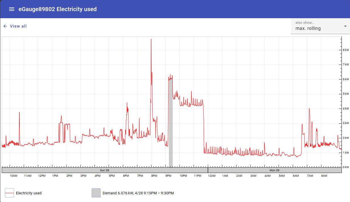
The demand interval used for this feature is set in the eGauge classic interface preferences editor which is accessed via the Main menu: Setup → Other Settings, then choose Preferences at the Left under the eGauge logo.
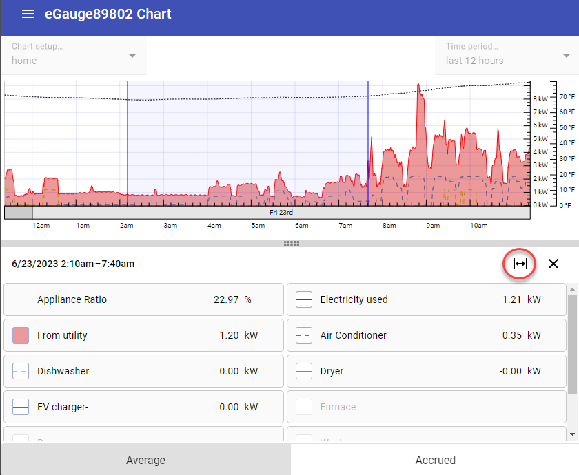
Viewing values at a specific point in time
Click on any point on the chart graph to view instantaneous register values at that specific point in time. Each item in the chart item list will display its value at the selected time.
Click the X at the top right corner of the chart item list to return to the main chart view.
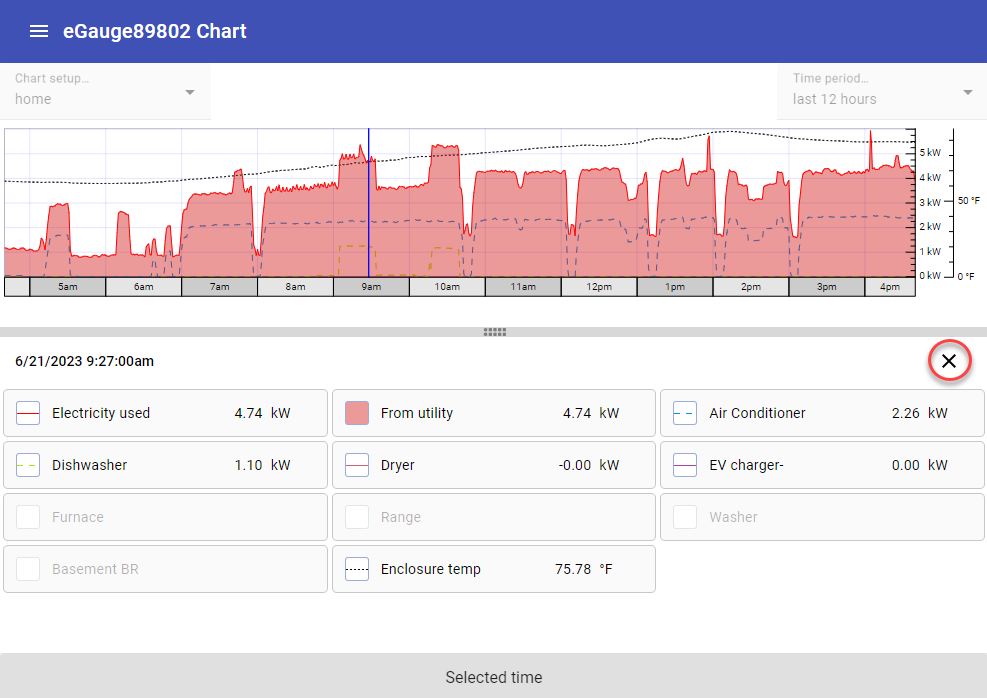
Clicking and dragging after selecting a specific point in time will shade in a period of time to inspect. Click the 'Zoom to selected range' button to zoom into the shaded area. Click 'Restore time period' to go back to the original set time frame of the chart.
Configuration
By default, the Chart view will contain chart items displaying values obtained from the "Usage" and "Generation" virtual registers configured under Settings -> Installation (assuming these virtual registers are configured). However, most users will want to add additional chart items.
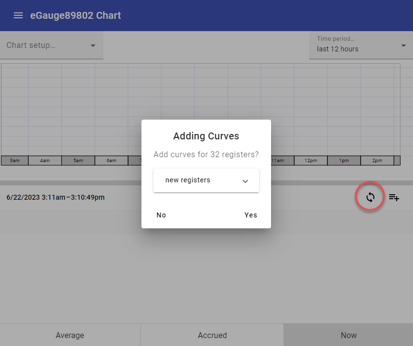
If your device has been configured, you may use the Chart Synchronization feature to auto populate a new chart with all available registers. Click 'Yes' to add all available registers to your new chart. As long as the synchronization option is enabled, the chart will continue to sync all available registers. Click the sync button again to disable synchronization if you want to remove some items from the chart list.
Charts created in the Chart view cannot be opened in the Dashboard view (and vice versa).
Tap or click the "Add" button above the register list to add a single new chart item.

The list of chart items may be hidden at the bottom of the chart. To reveal the list of chart items, click or tap on the bar at the bottom of the chart and drag up.

A fresh or empty chart won't have any chart items, and as such won't have an "Add" button. In this case, tap anywhere in the list area to add the first item.
Newly added chart items may take a few seconds to start displaying values. This is normal.
To edit an existing chart item, long press on that chart item in the chart item list.
This will open a window where a new chart item can be configured. There are three potential chart items which can be displayed:
Curve
A curve is simply a line generated from the values contained within a register in the eGauge's database. This is the most commonly used chart item. In this example, we'll graph the value of the Usage register (which records total site usage).
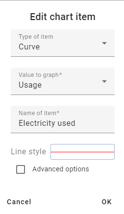
Value to graph - register used to populate the chart item with data. In essence, the actual value used to generate the line.
Name of item - name to display on the chart and chart item list. Completely arbitrary, but should make sense to the user.
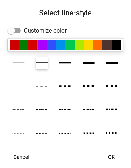
Line style - allows the user to define a line color and/or line style (solid, dashed, dot-dash) for the chart item. The "Customize color" option can be selected to choose a specific color or enter a HEX code for the desired color.
Advanced options
Physical unit - This setting will change the physical unit the reading is displayed in.
Flip sign of graphed value - unlike the Classic eGauge UI, the chart will graph negative values below the x-axis and positive values above the x-axis. To maintain the desired layout, it may be necessary to flip the polarity of one or more registers so they all graph above or below the x-axis.
Show accrued value - graphs a cumulative value instead of an average value. In essence, this displays a graph of the total value for a register. For most registers, this would be an ever increasing or decreasing line. When this option is selected, a new dropdown "Accrue since" will appear to select the start of recording for this register (eg, since start of hour, since start of day, and so on). Useful for measurements like pulse counts.
Shaded area
A shaded area can be used to add emphasis to the chart. There are many uses here, but in this example we'll replicate the shading present in the "Usage" line on the original eGauge UI.
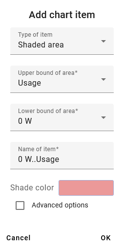
Name of item - name to display on the chart and register list. Completely arbitrary, but should make sense to the user.
Lower bound of area - the "bottom" of the shaded area. In this example we're using '0 W'. This dropdown will always display in the unit type for the register being displayed.
Upper bound of area - the "top" of the shaded area. In this example we're using the value of the "Usage" register
Lower and upper bound can be used to highlight the range between two chart items. This relationship cannot be inverted (eg, shading will display if upper > lower but not if lower > upper). A second shaded area item is needed for this.
Reported register value - The value reported for the chart item in the chart item list below the chart. Can be left blank, or associated with a register value. In this case, we're using "Usage" since the value of the shaded area and the value of Usage are the same.
Shade color - allows the user to define a shade color for the shaded area chart item. The "Custom color" option can be selected to choose a specific color or enter a HEX code for the desired color.
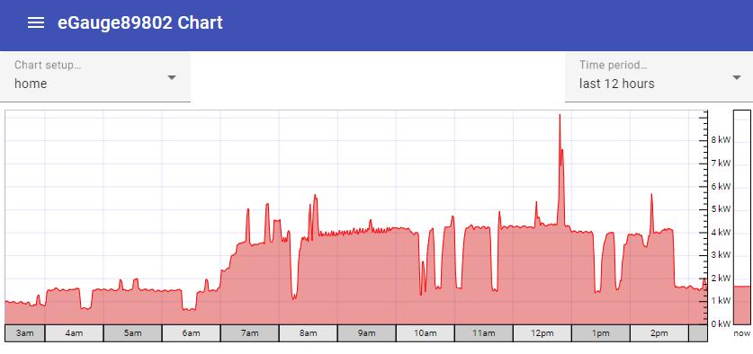
This is the result - note the red line for Usage, and the lighter red shaded area associated with that line.
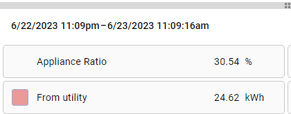
Ratio
As its name suggests, the ratio chart item can be used to display the ratio between two values. These values can be obtained from registers, fixed numerical values, or a combination of the two. Unlike the other chart items, a ratio item will only appear in the list of chart items at the bottom of the page (nothing is displayed in the chart itself). In this example, we'll look at the ratio between total usage and electric heat usage.
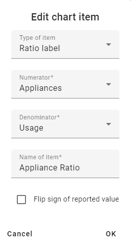
Numerator - "top" of the ratio equation. A ratio is simply A/B - this would be value A.
Denominator - "bottom" of the ratio equation. A ratio is simply A/B - this would be value B.
Name of item - name to display on the chart and register list. Completely arbitrary, but should make sense to the user.
Flip sign of reported value - can be used to flip the sign/polarity of the resulting value if desired.
Ratio chart items always return a percentage. In the case of this example, we can say "the Appliances account for approximately 30.54% of the total electrical usage".
Rearranging and Removing Chart Items
Chart items can be rearranged by clicking the rearrange icon above the register list:

To rearrange the register list, tap or click on a register and drag it to a new position in the list. To remove a register entirely, tap or click on the X on that item in the list. When your list has been arranged as desired, click the rearrange icon again to exit rearrange mode.
Registers are rendered in order - the first register is displayed in front of all other registers, the next register is displayed behind the first register and in front of the remaining registers, and so on. The page must be reloaded to see changes.
Saving and Loading Chart Setups
The layout of a chart (chart items, colors, line styles, data to display, etc) is referred to collectively as a "chart setup". Chart setups can be saved to the meter. This is beneficial, as it allows multiple layouts to be preserved and allows multiple users to select the layout they're interested in. For example, a building manager might want to see a general overview of the site, while a tenant might only be interested in their specific usage profile.
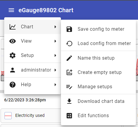
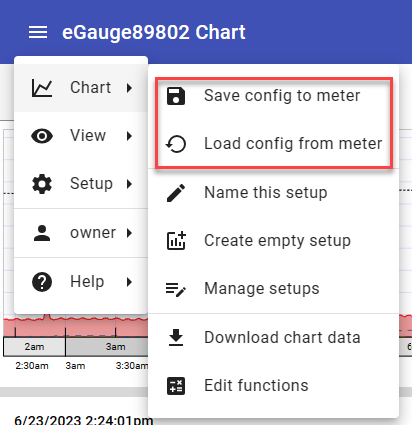
These functions are accessed using the menu in the top left corner of the page. Tap or click the menu, then tap or click "Chart" and select the desired function.
Save config to meter - saves the current chart setup as the default chart setup to load when the page is accessed by any user. This function is also used to save changes to existing charts and dashboards.
Load config from meter - loads the default chart setup. Use caution here if your current chart setup hasn't been saved! This function is also used for loading existing setups to new computers or new browsers that have not yet accessed the eGauge, or to update the setup when changes have been made.
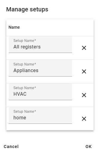
Name this setup - names and saves the current setup. Once at least one chart setup is saved, the "Manage setups" option will be available, and the different setups can be changed from the chart view itself.
Create empty setup - creates a new chart setup with no chart items. Use caution here if your current chart setup hasn't been saved!
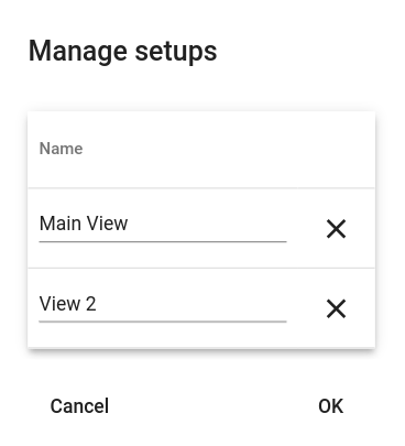
Manage setups - Opens a new window where the user can rename or delete saved chart setups. Click "OK" to save changes, or cancel to discard changes.
Downloading Chart Data
Chart data can be downloaded for use in external processing or to create a backup or report. To do this, click or tap the menu icon in the top left corner of the graph, select "Chart", then select "Download chart data."
The resulting export will only contain values for Curve-type chart items. These values are paired with both a unix timestamp and standard date and time value for ease of processing. The values themselves are instantaneous values which are are automatically presented in a granularity based on the time frame displayed in the chart.
For more control over export data, it may be desirable to use the JSON web API or the XML API
Chart data is not the same as a backup file. It cannot be restored to the eGauge meter in the event of data loss. For information on creating a backup file, see this article.
Dashboard
Overview
Available in firmware v4.1 and newer, the eGauge interface has a new mobile-friendly dashlet interface available to use on mobile and desktop browsers. This interface (referred to as the Modern user-interface) is designed to provide improved customization and reduced clutter compared to the classic eGauge UI.
A brief video overview is also available.
Make sure to read the main Modern User Interface page before continuing.
Contents:
Dashboard Appearance and Layout
Accessing the Dashboard
The Modern UI defaults to a chart view. To access the Dashboard for customization, use the main menu button in the upper left corner of the screen to navigate to: View -> Dashboard.
Mobile browsers will default to the Modern user interface.

Dashboard Management
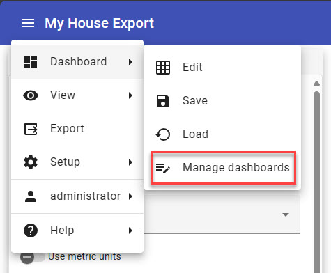
Introduced in Firmware v4.6, the Dashboard Manager is used to view the list of existing dashboards on an eGauge meter. From this page you can also create a new dashboard, make a copy of an existing dashboard for editing and delete Dashboard views that are no longer needed.
To access the Dashboard Manager, from the Dashboard view choose Dashboard → Manage dashboards. For full details please see: Dashboard Manager
Dashboard Examples

Dashboard with Usage and Generation dials, and summary area.

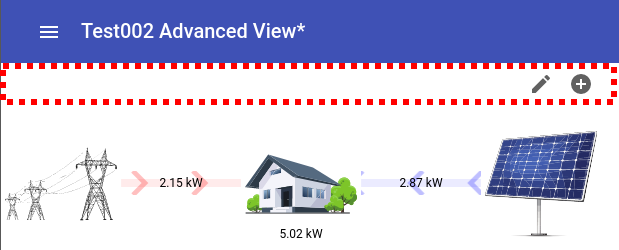
Dashboard with Flow Diagram showing a home's usage with solar and wind back-feeding to utility.
More complex Dashboard with a variety of dashlets monitoring total site usage in different ways.
Dashboard Appearance and Layout
The dashboard appearance and layout can be customized by the user. A single dashboard is made up of multiple individual components called "dashlets". Each dashlet can be placed and sized independently of every other dashlet. Dashlets snap to the the dashboard automatically.
To add, delete, resize or move dashlets, access the Dashboard and then, click the menu icon in the upper left hand corner and choose "Edit":
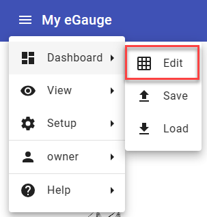
A bar will appear at the top:

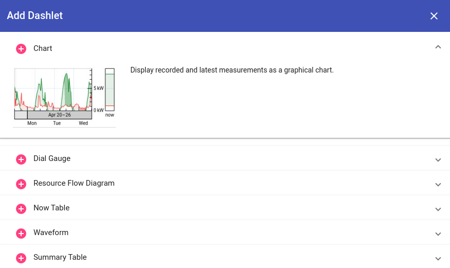
To add a dashlet, click the + sign on the left. A menu will appear with available dashlets. Click the plus button to add the dashlet, or anywhere else in the row to see more information on the dashlet.
To delete a dashlet, click on the dashlet so it is selected (entering edit mode), and press the center trashbin icon. To exit edit mode, click the X on the right side.
To resize or move, click the dashlet and a box will appear around it. It can then be dragged to a different location, and clicking and dragging the circles on each side will resize the dashlet.

Configuring Dashlets
In "Edit" mode, clicking the + button to add a dashlet will show available dashlets.
Available dashlets
- Chart: Displays measurements as a chart (graph) view. For more information on creating and modifying charts, see this article.
- Dial Gauge: Displays the most recent value of a single register as a dial gauge. It is also possible to display markers indicating the minimum and/or maximum values of that register over a certain time period (e.g., over the last 24 hours).
- Resource Flow Diagram: Visualizes how resources flow between user-selected icons. Can be used, for example, to show how power flows from the grid to a house or from a solar panel to the house.
- Now Table: Displays a table of the most recent measurement values. Each table row displays the most recent value of a register.
- Waveform: Shows waveform data obtained from raw inputs (voltage taps and current transformers). Similar to an oscilloscope. More information on the waveform view is available here.
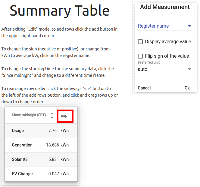
- Summary Table: Displays a table of measurement summary values. Each table row shows either the accumulated value or the average value of a register over a summary period. The summary period is selectable and can be a running summary (e.g., since 24 hours ago) or a set summary (e.g., since start of the day).
- Signal - Shows one of two signal icons based on a comparison of a register value against a constant.
- Export - Configure settings to download meter data in .csv format (firmware v4.6 and later)
- Switch - An on/off switch that is manually activated. Can be used to control the eGauge PRM3 power relay module.
- Alert Viewer - View and manage the eGauge system alerts without navigating away from the current dashboard view. (firmware v4.6 and later)
Charts created in the Dashboard view cannot be opened in the Chart view (and vice versa).
For the purposes of this article, dashlets will be split into two categories - simple and complex. Simple dashlets typically have minimal configuration options. Complex dashlets will have many more configuration options (and in some cases, dedicated articles explaining the full functionality of the dashlet).
Simple Dashlets


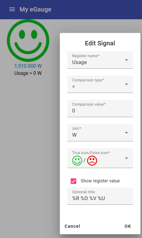
Signal Dashlet
The signal dashlet can be used to tell at a glance if a particular reading is above or below a particular threshold. Choose the register to alert on, the comparison type and the constant comparison value that will act as the threshold between the signal icons.
Complex Dashlets
Resource Flow Diagram
To edit the Resource Flow Diagram dashlet, exit "Edit" mode after adding. Then, hover the mouse or press along the top of the dashlet, shown in the red dashed line below. The pencil icon and plus sign should appear:
Clicking the pencil icon will allow you to edit or delete any existing item in the diagram. Click the icon to edit it, or the X in the lower right-hand corner to remove it from the diagram:

To exit edit mode, hover the mouse back over the top bar and click the pencil icon again.
To add an icon, click the plus button and select a grid location to add an item to. In the image below, the bottom-right corner has been selected:
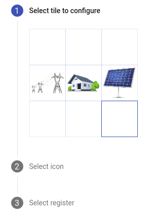
Then click the blank box to choose an icon:

A list of icons will appear. In this example, the Windmill icon was selected:
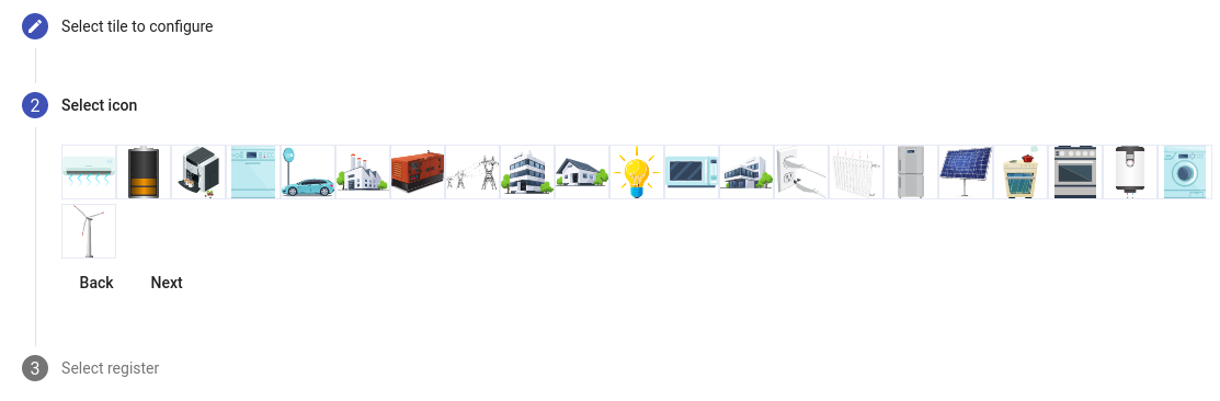
Finally select the associated register, in this case "Wind inverter":

Exit the edit mode by clicking the pencil icon, and the dashlet will contain the newly added item. Positive values indicate power is flowing from the item to the center of the diagram (generation), while negative values indicate power is flowing to the item from the center of the diagram (load). If the polarity is incorrect, either reverse it in the register or create a virtual register to flip the sign to avoid disrupting historical data. Creating a virtual register is recommended.

Waveform Dashlet
Unlike most other dashlets, the Waveform dashlet requires a significant amount of space to utilize effectively. It is not recommended for users with small or low-resolution screens. A dashlet size of 900x900px is generally adequate, but larger is better in terms of functionality and readability.
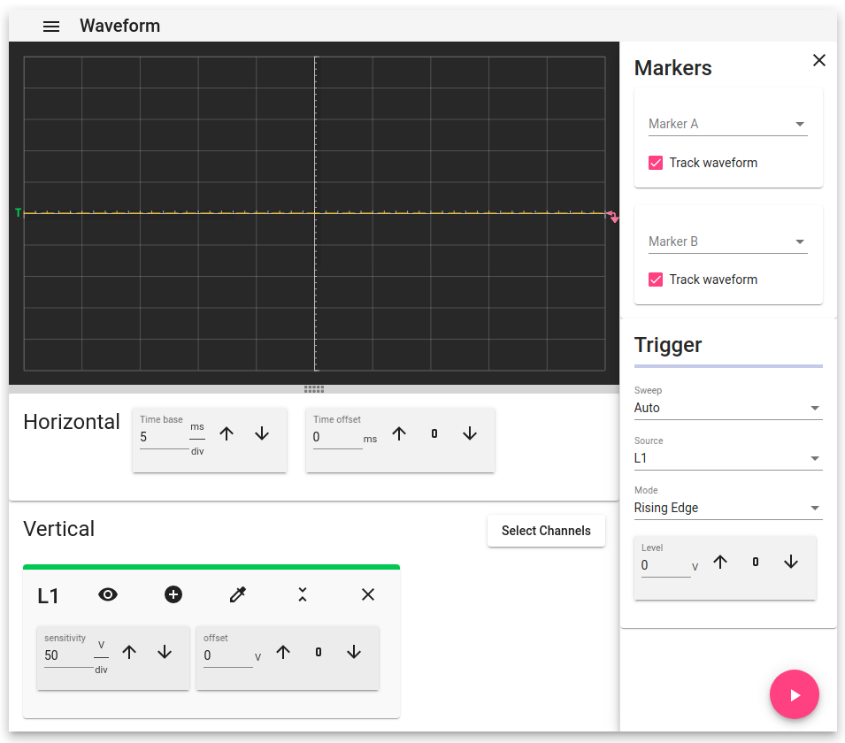
Once in place, the Waveform dashlet is controlled just like the dedicated Waveform View page. Full documentation on the Waveform View page is available here.
The Waveform View is very resource intensive. On devices with slow connections, it may work poorly or not at all.
Chart Dashlet
The Chart Dashlet allows the user to present a variety of information in graph form. Like the Waveform dashlet, it requires a significant amount of space. A dashlet size of 600x600px is generally adequate, but larger is better in terms of functionality and readability.
Once in place, the Chart dashlet is controlled just like the dedicated Chart element. Full documentation on the Chart Element is available here.
Charts created in the Dashboard view cannot be opened in the Chart view (and vice versa).
Export Dashlet
The Export dashlet has the same functionality as the Modern Interface Export function found in the Main Menu. As a dashlet, you can multiple Export dashlets to a dashboard, each with its own settings. For full details on using the Export function see: Modern Interface Export
Switch Dashlet
The Switch dashlet requires special user permissions and hardware to be utilized. In order to use and display this dashlet the user must be logged into the device with user credentials where the permission level is set to: 'Allowed to view data, change settings and control devices from anywhere' For more information about setting up user accounts please see: Creating usernames and passwords
At this time the Switch Dashlet can only be used to control the eGauge PRM3 Power Relay Module which will need to be physically connected to an EG4xxx meter via USB. The Switch Dashlet and PRM3 module are not compatible with Legacy EG3xxx or eGauge2 meters.
eGauge App Overview (Android and IOS)
Overview
eGauge Systems offers a mobile app for accessing and viewing meter data. The app is free and available on Android and iOS.
This article is intended to provide a basic overview of the app functionality. For additional information on the mobile-friendly view (app style layout available in a standard desktop browser) see this article.
For best results, use firmware v4.5 or newer with Modern Interface support. See the latest firmware version and the changes here.
Contents
Initial Setup
On first launch, the eGauge app will prompt the user to add a device. Assuming the mobile device running the app (phone or tablet) is on the same network as an eGauge meter, that meter will appear in the list of local devices. However, if no devices are present in the list it may be necessary to add the device manually by entering the device name in the eGauge app. In the screenshot below, no local devices are visible and so "eGauge52002" is being added manually.
Partial names are not accepted. The entered device name must be complete. Capitalization is ignored.
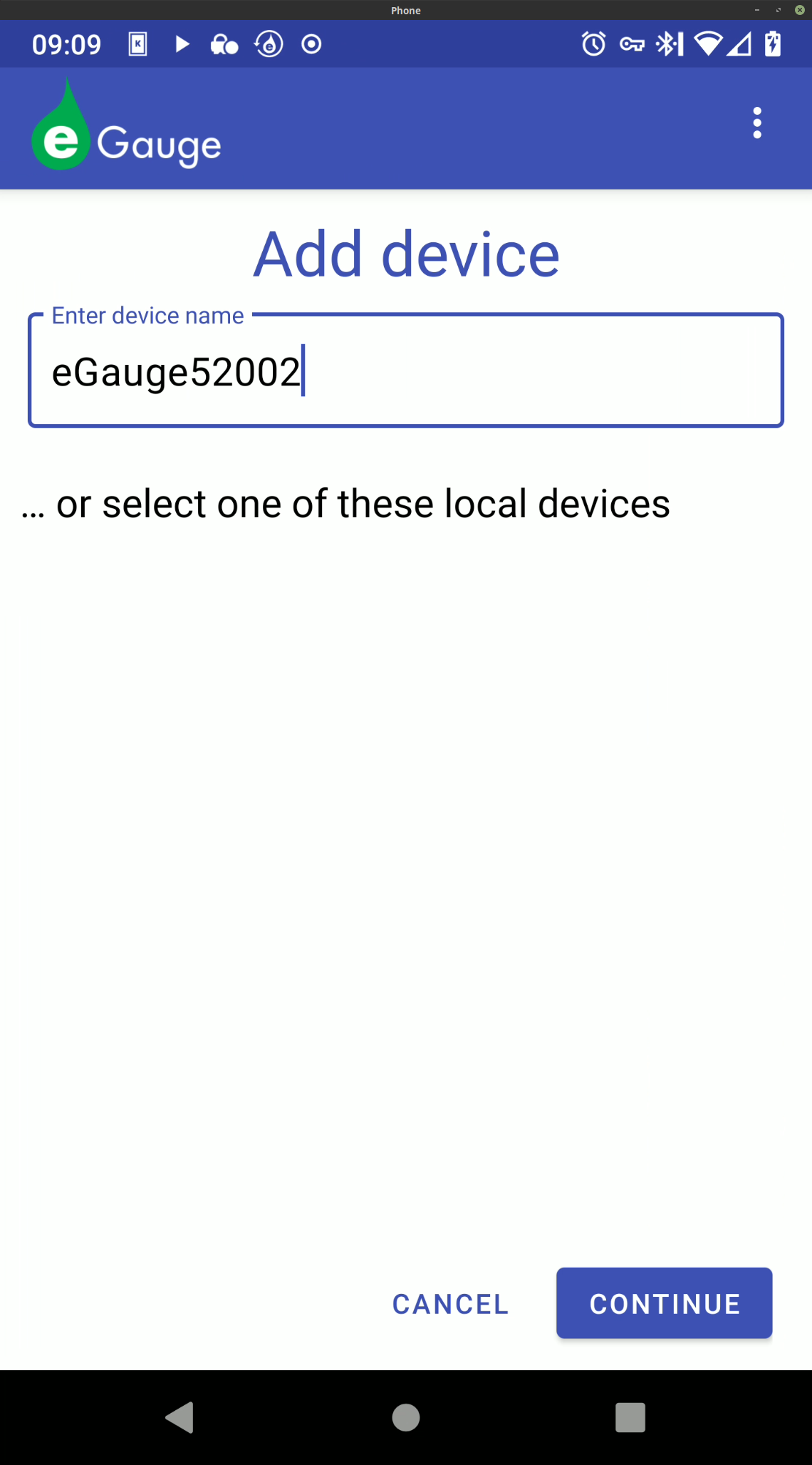
Once a device has been selected or manually entered, press the "Continue" button. The app will attempt to establish a connection to the specified device. If it is successful, the user will see the following page:
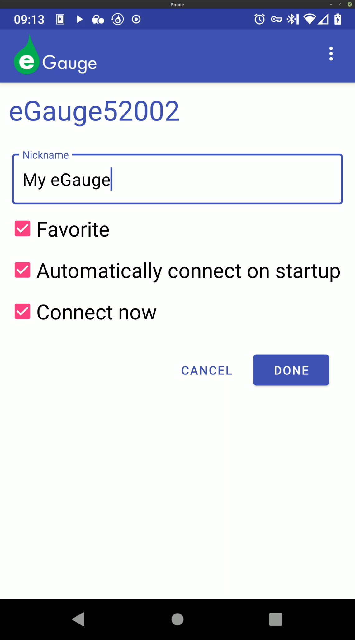
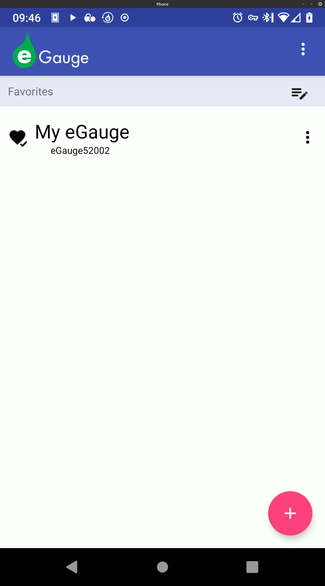
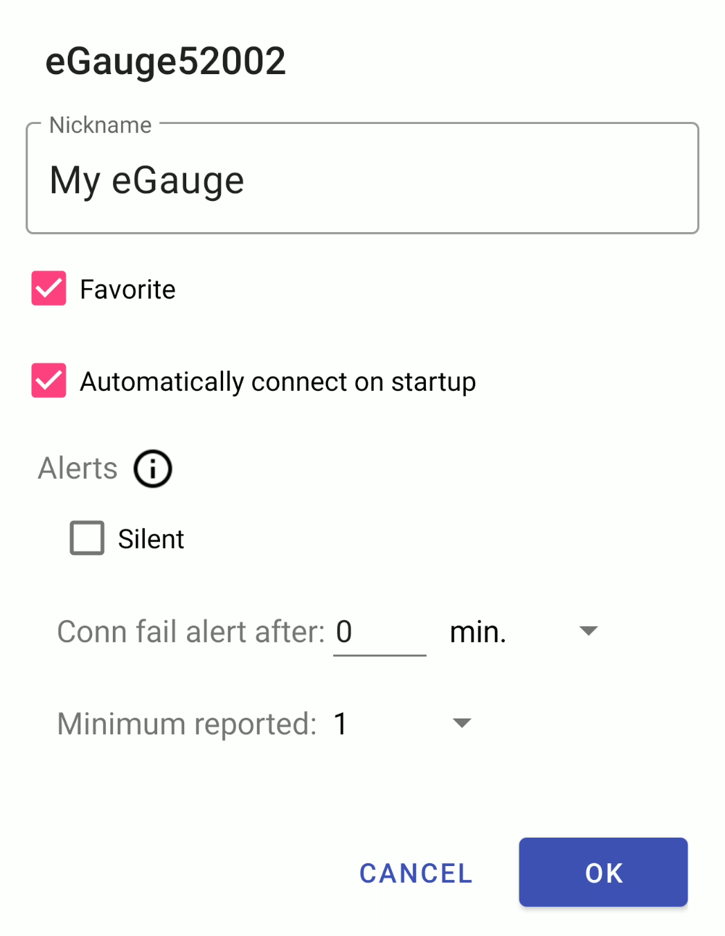
Nickname - Friendly nickname for the meter. Only applies to the app (does not change the public device name of the eGauge meter).
Favorite - Adds this meter to the list of favorites. This list allows the user to rapidly switch between meters of interest.
Automatically connect on startup - automatically opens this specific meter when the app is started. The most recent meter added with this option will become the meter which loads on startup (replacing the previous meter set to load on startup).
Connect now - connects to the newly added meter after the meter is added (by clicking "Done").
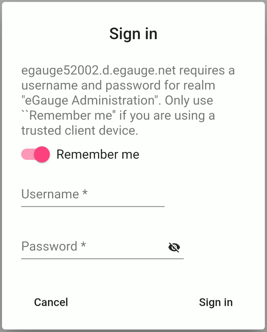
Make the appropriate selections and click "Done". Assuming "Connect now" was selected, the newly added meter will load. The user will be prompted to enter valid credentials for that meter. If "Remember me" is selected, the app will store these credentials and the user won't be prompted to enter them again.
After providing valid credentials, the meter UI will load. By default, the user will be presented with the Chart view.
Navigating the App
When the app is opened, a list of saved devices will appear. If a meter has been set to open on startup, it will be necessary to open the notification bar (swipe down from the top of the screen on most android devices), locate the entry for the eGauge app, and click on it. This should look something like the example below:
The main app page is shown below. Note that eGauge52002 or "My eGauge" from the setup example is listed.
Adding a new device
To add a new device, tap the "+" icon in the lower right corner of the page. The process to add a new device is identical to the initial setup.
Editing a device entry
To edit a device entry, tap the three dot icon to the right of the device name. This will open a menu for that device:
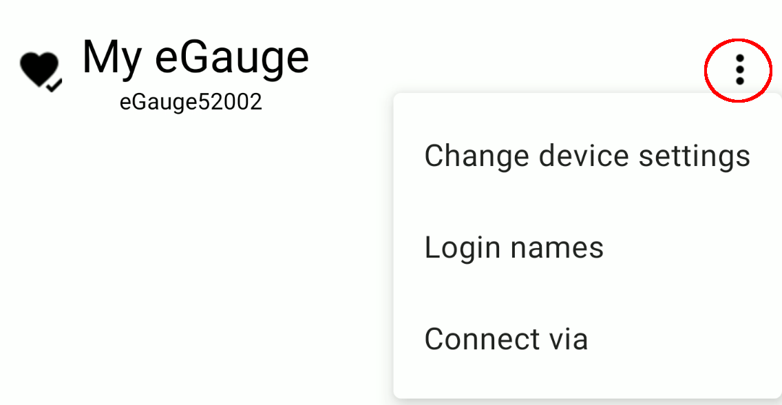
Change device settings - allows the user to modify the settings for an existing device. From here, the device nickname can be changed, the device can be favorited/unfavorited, automatic connect can be enabled/disabled, and alerts can be muted.
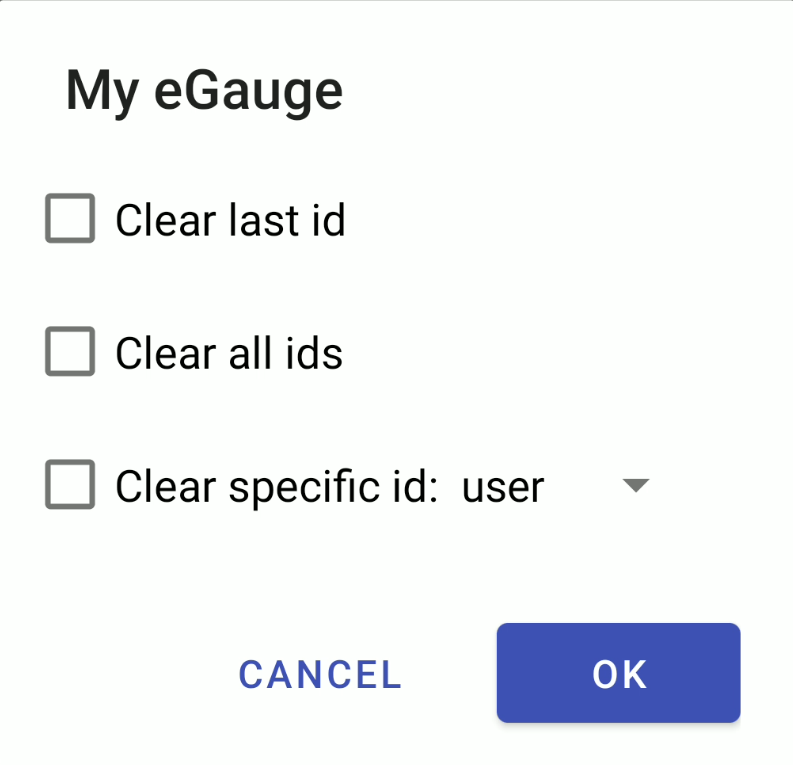
Login names - allows the user to clear credential sets (IDs) stored for a specific device. To clear a stored ID, select the appropriate option and tap "OK". This is useful if invalid credentials have been stored for a specific device, or if a user has accessed their device through the app on a mobile device they don't own.
- Clear last id - Clears the last set of credentials used to access the meter via the app. Useful if invalid credentials were entered.
- Clear all ids - Clears all credentials associated with a specific meter.
- Clear specific id: <dropdown> - Clear a specific set of credentials.
Clearing credentials will only remove stored credentials from the app. Credentials on the meter will not be modified/removed.
Connect via - allows the user to select from a variety of connection options.
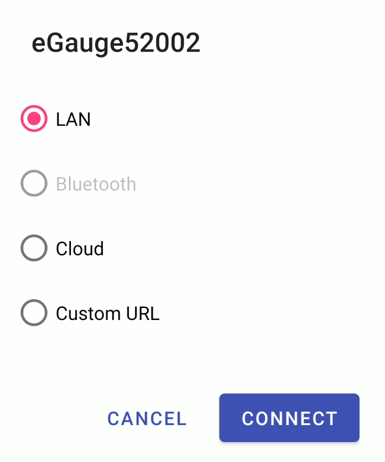
- "LAN" is a local network connection (suitable when an eGauge is on the same network as the mobile device used to access the eGauge).
- "Bluetooth" allows for a bluetooth connection between the eGauge and mobile device (bluetooth support is required, and the devices must be within range). A supported bluetooth dongle must be connected to the eGauge meter. Bluetooth dongles are supported by the EG4xxx meter line only.
- "Cloud" uses a proxy server connection through d.egauge.net to communicate with the meter (suitable if the eGauge is on a different network than the mobile device).
- "Custom URL" can be used to force a specific URL to be used.
Reordering favorite devices
If more than one device is present, the user can tap the icon on the "Favorites" bar to reorder their favorite devices.
![]()
This will change the icon to the right of a device listing from three dots to four horizontal bars.
![]()
When this icon changes, the user can tap and drag the icon to reposition the location of the device in the list of favorite devices. When finished, tap the check mark in the "Favorites" bar to save changes.
![]()
App Settings
To access app settings, tap the three dots in the top right corner of the screen and select "Settings".

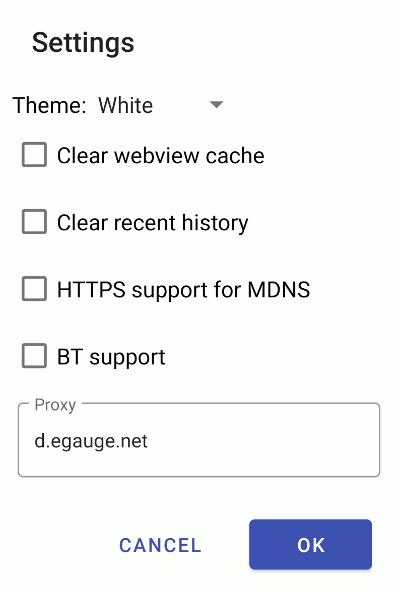
Theme - select either a white or dark theme.
Clear webview cache - clear the app cache, may be useful if elements are failing to render properly when loading a specific meter.
Clear recent history - clear recent meter browsing history.
HTTPS support for MDNS - allows HTTPS connections to local addresses (eg, DEVNAME.lan or DEVNAME.local).
BT support - enables bluetooth support. Only supported with EG4xxx meters using a supported bluetooth dongle.
Proxy - allows a different proxy server to be used. For example, lighthouse solar devices would need to use the d.lighthousesolar.com proxy.
Changing the proxy field to an unsupported value will disable remote connections to meters via the proxy server.
Alert Settings
The eGauge app can be used to monitor alerts trigger on an individual meter. For information on configuring alerts on a meter, refer to this article. To access alert settings, tap the three dots in the top right corner of the screen and select "Alerts".

The alert settings menu will appear.
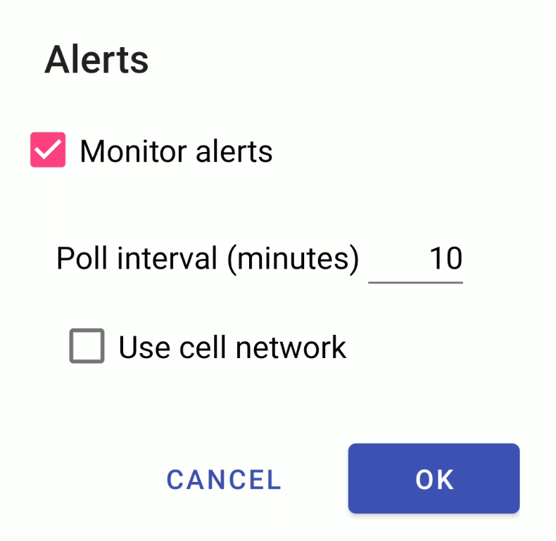
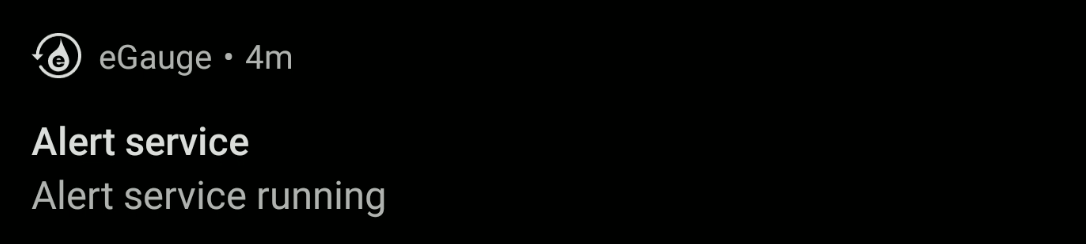
Monitor alerts - monitor alerts set on the meter. When an alert is triggered, a notification will appear on the mobile device. Alerts are unique to each eGauge meter and must be configured on a per-meter basis.
Poll interval (minutes) - how often the app checks meters for triggered alerts. Values under 1 (one minute) are not supported.
Use cell network - use mobile data to check meters for triggered alerts. Not recommended for large numbers of meters.
Using mobile data to poll for alerts can result in mobile data overages. Be cautious when using mobile data with short poll intervals.
About
In this section you can find information about the version and build of the eGauge app that you have installed on your device.
Log Buffer - The log buffer stores the app event log for a short period of time. Bug reporting for the app can also be accessed by viewing the log buffer and then tapping the 'Report Bug' button at the top left of the page. When reporting a bug, please include as much detail as possible. This tool will use the email client installed on your mobile device to send the message to eGauge developers.
When using the log buffer to report a bug, diagnostic information in the log will automatically be included in your message.
Configuration - This section contains diagnostic information that may be useful to eGauge developers for troubleshooting purposes.
Navigating the Mobile UI
The mobile app features four primary display elements. Each element is designed to present different types of data in different ways. Some elements (such as the chart and dashboard) offer significant customization options. To switch between the various elements, tap the menu in the top left corner of the app and select "View". The current element will be greyed out (in the screenshot below, chart is greyed out because the chart is currently loaded). Use the "on startup..." option to select which element to display when a meter is first opened in the app (the chart is the default option).

Chart
The chart element provides clean and streamlined graph-based display. This element is similar to the original eGauge interface, but features additional customization options and is optimized for a mobile interface. More information on the chart element is available here.
Waveform
The waveform element allows for deep inspection of individual measurements taken by the eGauge. This tool is useful for phase checking and other analysis of raw sensor readings. More information on the waveform view is available here.
Dashboard
The dashboard element is a modular display which allows the user a great deal of customization. Multiple layouts can be created to get a better sense of how specific data points relate to one another. These layouts can be saved and utilized by others accessing the device. More information on the dashboard is available here.
Classic View
The classic view element simply redirects to the original eGauge interface. This interface is much more limited in terms of customization, but some users may prefer to work with the original interface depending on their needs. More information on the classic view is available here.
Saving and Sharing Charts and Dashboards
Valid login credentials are necessary to use the Modern UI, be sure to share these with any users who want to view the Modern UI or use the App.
When using the Modern User Interface you can create charts and dashboards and save them to the eGauge meter to view on additional computers or browsers. Setups need to be saved to the eGauge to be available to any browser other than the one it was created on.
Saving and Managing Chart setups
After configuring a chart on an eGauge (or after making changes) it's important to save your configuration to the meter.
When you are happy with your configuration, use the menu button in the top left corner of the page to navigate to 'Chart' and choose 'Save config to meter'. This process will save your customized charts to the meter and make it available for other users to access.
When a new user views the interface, or if changes have been made and saved to an existing configuration, they will need to Load the configuration from the meter to their browser. Use the menu button to navigate to 'Load config from meter'. When an existing meter is accessed from a new computer or browser, this step should also be completed.
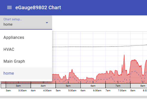
If you have multiple charts saved on a single meter, it will be useful to name your chart setups for easy identification. Use the menu button to navigate to 'Chart -> Name this setup' to add a custom name to a chart. Add a unique name to the 'Save setup as' popup. Once saved, you will be able to switch between chart views using the Chart setup dropdown in the upper left of the chart:
To delete or rename existing Chart setups, use the main menu to navigate to: Chart -> Manage setups. Here you can rename an existing chart setup or delete charts that you no longer want. Don't forget to save your configuration to the meter after making changes!
Saving and Loading Dashboards
After configuring a dashboard on an eGauge (or after making changes) it's important to save your configuration to the meter.
After completing your dashboard configuration, and setting up your added Dashlets, use the main menu to navigate to 'Dashboard -> Save'. Give your Dashboard a name in the 'Save dashboard as' popup and click ok. Don't forget to save your configuration to the meter!
Existing Dashboards can be edited and saved with a new name to create additional dashboards.
To load an existing Dashboard to a new computer or browser, use the main menu to navigate to: 'Dashboard -> Load'. Choose the Dashboard you would like to view from the list of existing Dashboards.
Export
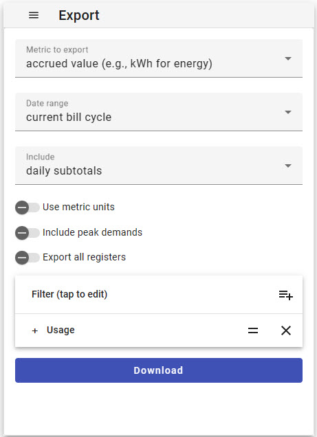
The Export function is used to export register data in .csv file format. This function is available in Firmware v.4.6 and later and is available as a standalone menu item and as a Dashlet.
Access the Export function from the Main Menu by choosing Export directly from the main menu.
Metric to export
- average (e.g., kW for energy) - export average values.
- accrued value (e.g., kWh for energy) - export cumulative values relative to the start of the chosen date range. Note that not all readings will make sense as accrued values such as temperature, or irradiance.
- value accrued since epoch (e.g., kWh for energy) - export cumulative values relative to the start of recording for the meter.
Date range
The date range defines the time frame that your data export will include. Choose one of the pre-set time ranges from the list or set a custom range by choosing 'custom range' from the list and setting the start and end dates with the calendar pop-up. Any pre-set ranges that reference billing cycles (current or previous) will use the date set in the Preferences page of the Classic interface.
Include
- final values only - This option will return simply the total accrued value for the entire date range chosen.
- subtotals - Any of these options will return subtotals or averages at the granularity specified. Available intervals are:
- hourly subtotals/averages
- daily subtotals/averages
- weekly subtotals/averages
Options:
- Use metric units - metric units will be used where applicable when this slider is enabled.
- Include peak demands - enabling this option will include a demand register as well as a peak demand time for each power register included in the export. Options visible when this slider is enabled include:
- calculate peak using: (need to add more detail about demand options)
- set demand
- rolling demand
- demand polarity:
- positive
- negative
- positive or negative, whichever is (greater)
- Demand interval length: can be set to 15, 30 or 60 minutes
- calculate peak using: (need to add more detail about demand options)
- Export all registers - enabling this slider will automatically include all configured registers in the export. Disabling it will enable the Filter option covered in the next section.
Filter
Use the filter to choose which of your configured registers you'd like to include in your data export. This function is only visible when the 'Export all registers' option is disabled. Click on the 'Add a filter' icon and choose the items you'd like to include in your export to add them to the list. Choosing the 'remove selected registers' option will remove chosen items from the filter.
To add a new filter, tap the 'Add a filter' icon. You can choose to add or remove registers in the 'Append new filter' dialog based on the following options:
Filter by:
- Register Name - Filter available registers by register names that exist in the Installation Settings of the meter. This option is useful when you have a list of specific registers that you would like to include, and you would like to specify them by name.
- Register type - Filter available registers by type. Using this option, you can choose to add all registers of a specific type, e.g. all registers recording 'Current' readings.
- Regular expression matching register names - advanced feature. This field can accept a regular expression (regex) that may exist within the Installation Settings register names.
Dashboard Manager
Introduced in Firmware v4.6, the Dashboard Manager is used to view the list of existing dashboards on an eGauge meter. From this page you can also create a new dashboard, make a copy of an existing dashboard for editing and delete Dashboard views that are no longer needed.
To access the Dashboard Manager, from the Dashboard view choose Dashboard >> Manage dashboards
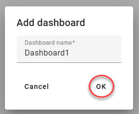
When you load the Dashboard manager, you will see a list of dashboards that have been created on the eGauge. If none have been added yet, you'll see a message: "There are no dashboards to manage. Tap here to create one." Tap or click the screen to begin creating a new dashboard.
When you give your new dashboard a unique name, and click ok it will appear in the list.
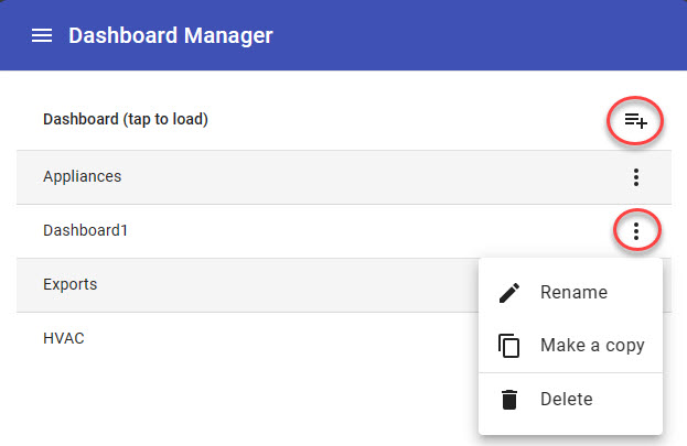
When one or more dashboards have been added to a meter, you'll see your list of dashboards when you enter Dashboard management. Click on the 'Add a dashboard' icon circled above to add a new dashboard.
Each dashboard has a menu of options related to it accessed by clicking the three dots. In this menu you can:
- Rename - Give an existing dashboard a new name.
- Make a copy - Create a copy of a dashboard for editing.
- Delete - Delete a dashboard that's no longer needed.
Click 'Back' at the bottom of the screen to return to the Dashboard view or use the Main menu to navigate to another area of the interface.
Alert Viewer
The Alert viewer dashlet was introduced with Firmware v4.6. It can be added to a dashboard to view and manage the eGauge system alerts without navigating away from the current dashboard view.
System alerts are displayed in the Alert viewer in a list form including the alert condition and the date and time when it last triggered. Each alert can be expanded out to show additional detail by clicking on the 'down arrow' on that line as shown below.
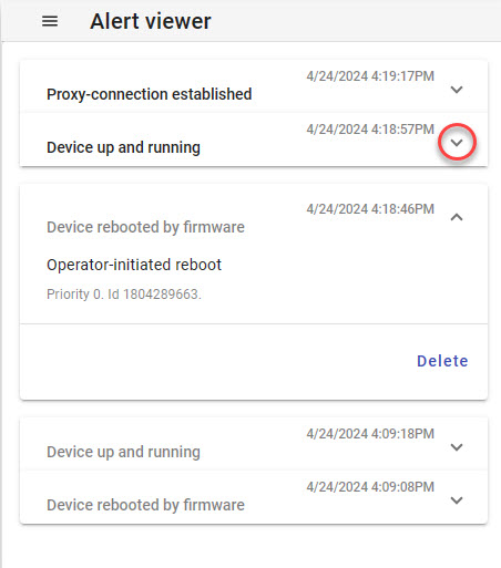
Once an alert has been expanded it will be marked as 'read' or 'acknowledged' and will be displayed in greyed text. The reported alert may be removed from the log by clicking the 'Delete' button. Deleting the alert entry will only remove the log entry, if the alert is triggered again a new log entry for the alert will show in the list.
The Alert viewer has its own menu, similar to the Main menu, with different items:
- Save config to meter - Saves option changes to the Alert viewer dashlet to the meter. This currently saves the default 'Recheck' interval for the Alert Viewer.
- Load config from meter - Load option changes to the Alert viewer that may have been saved on another computer or browser.
- Configure alerts - Choose this item to configure user-defined alerts and related options. For more information please read: Configuring Alerts (Modern Interface)
- Recheck - Use this option to set the interval at which you want your dashlet to automatically refresh with new alerts. Choose 'now' to refresh the list at any time without affecting the set interval.
- Mark all as read - Choose this item to mark all alerts in the list as read. Alerts marked as read will be greyed, new alerts will show up in black text.
- Delete all - Choose this option to delete all existing system alerts from a meter. This cannot be undone.
Health Checker
Introduced in Firmware v4.5, the eGauge Modern interface includes a health checker which can alert you to conditions and alerts that you may need to take action on without having to periodically check the alert log. Please note that most health checker functionality requires that the meter has an active Internet connection and is available to the eGauge server.
When a condition exists that may need to be addressed, a 'Caution' symbol will display in the upper Right hand corner of the interface, as shown below. Click on this symbol to view pending health alerts. This symbol will only appear when there are pending health alerts based on the health Checker settings.
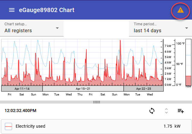
Clicking on an individual health alert will bring you to the settings page in the eGauge interface where you can attempt to resolve the issue.
Health Checker Settings
To customize your health checker settings, access the settings page from the main menu. Choose Setup → Health Checker. The settings can also be accessed directly from the main menu within the Health Checker.
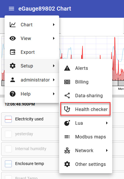
Available options are:
Enable health checking - Turn this slider to the 'off' position to disable the Health Checker.
Notify me if:
- any firmware update is available - Notify if there is a firmware update available for your meter.
- alert is pending - Notify of a new system alert or user defined alert has triggered with a priority level at or higher than the priority this option is set to.
- meter has incorrect time - Notify if the date and time on the meter does not line up with the NTP server.
- time is not synchronized with the network - Notify if the NTP server is unreachable.
- meter cannot share data - Notify if the configured data push function fails.